Web Trend Map 2007 Version 2.0
Version 3 of the Web Trend Map is here! Click to read more.
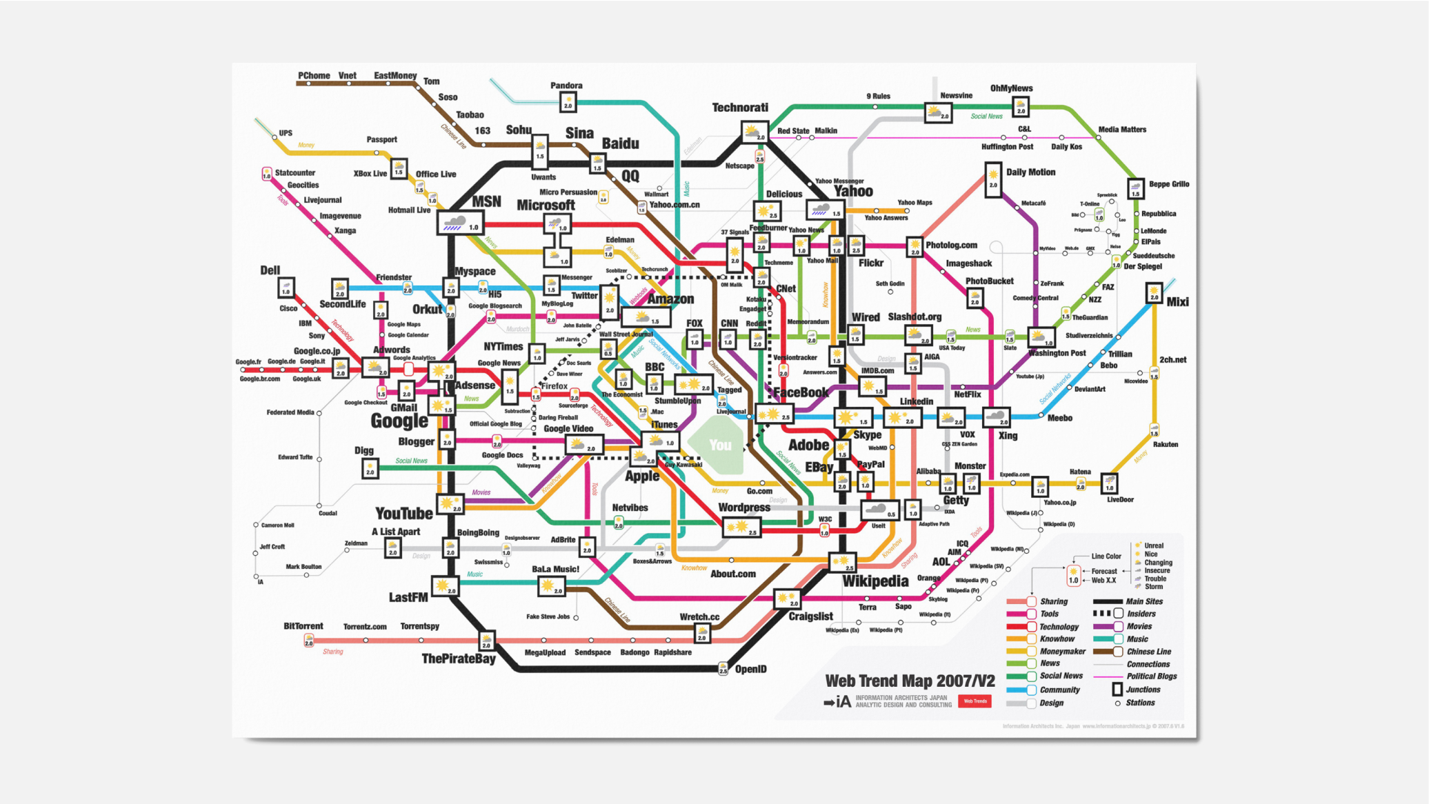
We have done it before: the 200 most successful websites pinned down on the Tokyo Metro Map, ordered by category, proximity, success, popularity and perspective. Now we have done it again — and better. Back by popular demand: here is iA’s next Web Trend Map:

Download It!
We figured that this would make a nice desktop background image as well. So here are some wallpapers to download and replace that ugly Windows Vista crap or the boring blue Apple background image. We’ve also included a big A3 version and an OSX screensaver.
What’s New?
First of all, the new Trend Map features many more websites than the previous one. While the focus is still on English language sites (because that’s where it’s at), we have added some Japanese ones (a mystery to most of you gaijin), some German ones (yeah, there are some popular ones) and a Chinese line (the second Internet).
More Consistency
The different trend lines have been renamed, simplified and cleaned up. Now, if you follow the Technology line—you will find tech sites; if you follow the News line—you will find news sites.

More Lines
The original raster (Tokyo metro map) has been substantially modified to fit the needs of an Internet Trend Map.
Less Japanese Jokes
There are less insider jokes about the different stations and more consistency between the connections and the neighborhoods of the different sites. Still, people who know Tokyo will find lots of little hints and sarcastic comments hidden in there.
- Google has moved from Shibuya, a humming place for young people, to Shinjuku, a suspicious, messy, Yakuza-controlled, but still pretty cool place to hang out (cf. Golden Gai).
- YouTube has conquered Shibuya.
- Microsoft has moved to Ikebukuro, if you know what I mean.
- Yahoo is in Ueno - a nice place, but nothing going on there.
- Wikipedia is now in Shimbashi, the place for square and hard-headed salarymen - a bit like the Wikipedia watchdogs.
- The Chinese line runs parallel to the “Sharing line”, which starts with the main pirates…
- Paper info designer Edward Tufte is directly below the Federated Media, right before joining with the interactive information design circle at a 90 degree angle.
- “You” are in the Emperor’s palace, at the center of the network.

More Revealing Coincidences
- The main Japanese sites are all on the Money line. I never noticed before, but most big Japanese sites are financially successful.
- The northern part of the Main Sites line (the Yamanote line) is a boring, unknown territory (just like in the real Tokyo).
- Ze Frank ended up close to the German carousel.
- iA ended up close to the pirates.
- Adobe moved from Ginza (high class) to Tokyo station (anonymous, lots of money there), alluding to the fact that they continue to move towards the center of gravity without being too loud about it.
- Skype has conquered a place that doesn’t exist.
Insiders Circle and Your Palace
There is a new Insiders circle, with the tech trend scouts, the tech bloggers… and You, occupying the Emperor’s palace.
Trend Forecast
Of course, you will notice that we added a weather forecast. This is our six month prognosis for each candidate (no big surprises there).
Web 0.5, 1.0, 1.5, 2.0, 2.5?
Last but not least, we have added a Web Generation number (Is it Web 1.0 or Web 2.0? Is it corn or is it a nut?). I don’t want to spoil all of the little things in there, but please note that there are some websites that are Web 1.5, some that are 2.5, and some that are 0.5. This is not a mistake. Web 2.5 is what Facebook is up to… Web 0.5 is what Jakob Nielsen is still doing. The Generation number is not necessarily qualifying, but it’s not surprising that websites that do well are usually above 1.0; some of them (like eBay and Wikipedia) were 2.0 long before the term was coined.
More Mistakes
Of course, there are some totally absurd and meaningless coincidences, due to the complexity of the map. There might also be some misspellings and, here and there, you may discover something totally obsolete. Please feel free to comment on these goofs. Also, if you feel that we forgot a (your) major site, put a wrong weather forecast or got the Web Generation number wrong, please tell us.
Less Logos
You might have noticed that we had to take off the inverted Tokyo Metro logo, featured in an early version of the first Trend Map. This is because they asked us to. We respect the decision of the Tokyo Metro Corporation, but we still believe that it wasn’t a smart move for them. The map has been downloaded 10,000 times and has been featured in traditional and online media all around the world. For a couple of weeks, it was one of the cooler tech advertising spots on the net.
Sponsor It!
We are now offering the free space in the lower left corner to sponsors. If you have a company and you want to be featured as a sponsor, feel free to contact us. There are ten spaces available, for US$2,000 each. You can also buy the whole adspace for yourself.
Your sponsorship will be featured in all versions of the map over the next 6 months: 1. Desktop background images. 2. Printable A3-size PDF. 3. Clickable webpage. 4. A big poster that will follow as soon as we have the sponsors. 5. A simple screen saver.

Who gets the space? Basically, it is first come, first served, but the sponsor that wants to buy the whole adspace at once will be able to outbid the small sponsors.
Enjoy It!
First of all, it’s fun to look at. If you’re a geek like us, you might just want to download the A3 PDF, print it out and hang it on the wall. Then you can stare at it all day long.
Work With It!
We use the Trend Map as an in-house consulting tool. It has helped us explore, define and explain the Internet strategy and positioning of all of our clients since we first introduced it in January. Each website on the map stands as a (more or less) successful paradigm for an interactive brand, design or business model. In order to position yourself, you need to know your place on this map.
How to use it
- Find the possible existing candidates that serve as a paradigm for your client’s redesign, repositioning or strategy change.
- Evaluate each candidate according to technical, brand and business affinity (good: green, average: yellow, bad: red).
- Explain your evaluation and let your client choose which design, strategy and business paradigm he wants to follow.

Use It as Your Start Page!
We also created a clickable online version that you can set as your default start page, if you wish. Use it as a starting point in your daily data hunt.
And Then?
This week, we’ll straighten out a couple of small mistakes. As soon as we get some sponsors, we’ll print a couple of posters. In the next big release (December), we are planning to add more international sites. We are currently working on the Japanese, French, Portuguese, Spanish, Swiss and German lines.
UPDATE: Microsoft was interested in the sponsorship, but in the end it was probably too long a long shot, what with the prognosis we gave them.
UPDATE2: The web is going crazy for our map: Wired, Techcrunch, Mashable, Valleywag, Boingboing… They all love it. We hit 100k page views with the Trend Map today.


0.5?! haha… picking a fight?
Great work. Thanks!
AMAZING. I wonder how much time it took you to make up this map?
this is impressive. i am in amazed how you could deal with stations having multiple lines. would have been a tough mathematical problem for me
by the way, why flickr has the gray cloud with it. i thought they were doing great, users from yahoo photos are redirected to it.
you should also mention movable type 4, which is going open source soon. and also google reader, which gets more users than netvibes
@German: 0.5 (J.N. and W3C) is a actually a form of flattery. It means “hardcore”.
@David: Hard to say, as there were a couple of subversions since last december, as we developed it for our client presentations. The update took all in all about 48 working hours.
@heri: Flickr is not all sunshine. They messed with their users big time and got some of them pretty angry (me too). The cloud before the sun means (changing) and in this case it means: They could have done better. Generally, I am very critical about acquired websites. They loose the spirit (see dodgeball or reddit). Flickr is doing quite well and they will be there for good.
I am not sure if this maths help you there. You need to know what you are doing. The hardest part is not the lines, it is to get the right ones close to each other. After 4 years of absence the German web was kind of tough to get and is still not satisfying.
Some grave mistakes to be corrected today: 1) Wanadoo doesn’t exist anymore 2) Scobeleizer -> Scobleizer 3) How did grand central get in there? 4) ICQ should be closer to AOL
Very interesting and definitely useful to make quick strategy decisions!
Also, thanks for the Chinese line, so useful!
Maxime
Excellent work guys! Can’t wait to see which companies are smart enough to sponsor this.
Very nice indeed - I now have an almost exact overview of current web technologies
When comes the screensaver?
In Google api
Paul, indeed, we need a screensaver too. I always wanted to make one… BTW, it seems like we’ve sold one sponsor-spot today. If we sell all of them, we are going to invest more time into it, to develop it even further. We have a nice idea for it. So please don’t hesitate to trow up some mini-VC, you won’t regret it… There are 9 places left.
This is awesome, you should be selling prints of this!
I noticed Adaptive path is spelled as “Adaptive Pth” on the PDF, fyi
Thanks Brendan,
I corrected the mistake.
I can’t resist the pun: Now the Internet is a series of tubes!
Livejournal is on here twice (just left of Facebook, and also near the left edge of the Tools/Statcounter line.
Cool map - very interesting way of displaying this information. A couple of things: Walmart is misspelled (sorry, not trying to nitpick, but this thing is so close to perfect, might as well bring it home). And maybe I missed it, but I can’t find ESPN.com - that’s gotta make the list, right?
Foof & Kevin,
Thanks for pointing that out. Very appreciated. I’ll correct these mistakes before going into print.
there is error on clickable version
Torrentspy’s URL is invalid - http://www.torrentspy.cpm must be .com
Great work guys. Very inspiring. Now that Feedburner was bought by Google, they should go further from Yahoo! and closer to their new owner.
You could actually switch Feedburner with Mybloglog.
Why is Microsoft in storm? Why Microsoft technologies are 1.0? What about ASP.NET AJAX, Silverlight, PopFly?
Anyway it is very nice. It is a good idea to design a widget to display a current user location on this map…
Muy buen aporte, la verdad muy creativo, dia a dia se ven cosas nuevas con mucho ingenio, espero algun dia poder aportar algo asi.
saludos desde México.
“Especialmente desde Sonora.”
Proximity mapping taken to an unreal degree, and I especially got a kick out of one of my most used tools, Skype, conquering its own space, a perfect example of the Blue Ocean Strategy at work if I ever I ever saw one (even though other services have tried to play catchup, no one has come close to Skype).
I just blogged it so all of my readers will benefit from it. Web consultants should kick ass and take names with such a valuable resource.
Where’s Ars Technica? It’s the 7th most popular site on Technorati: http://technorati.com/pop/blogs/ and one of the biggest Tech sites online. Am I missing it?
Well done — I like the fact that it borrows from the look and style of the Tokyo Metro map, but doesn’t try to be so much like it that it compromises the data.
A couple of bugs I noticed, though:
Google Analytics’ site is empty: no “forecast”, no “web X.X” indication.
There is a disconnected “1.0″ floating over the “b” in eBay.
Not a bug, exactly, but I guess you changed your mind about having the text outlined in white and missed changing Firefox, which is still outlined.
There are several disconnected “white dots” floating here and there, which don’t cause any problems right away, but might if you move stuff around and they obscure it.
Great map!
Could you please add a 1280 x 1024 version, too? (Downscaling the larger version leads to an image with less quality…) Thank you!
You forgot some sites…
http://www.blackplanet.com/ http://www.migente.com/
(We have others, but I don’t know that they do enough traffic to make it up there.)
BP and MG are both in Hitwise’s top 20 social networks, at #5 and #20: http://weblogs.hitwise.com/leeann-prescott/2007/05/facebookvisitsup106since_o.html
Cool cool map. Just a remark… isn’t the space for each advertiser a little too small?
so where is http://popurls.com !?
Hi Oliver, thanks for the map, and… congrats on getting TechCrunched!
This is very educational as well. Can’t wait to show this to higher level manager and then will be asked to explain the whole thing. One suggestion, next time you might want to try 3D. Would be much more fun.
Beautiful, cool, amazing…
Nice work, guys and gals of iA.
This is like Web 2.0 meets SneakerNet.
Looking forward to the print version for me and my associates.
best, Mark Alan Effinger
how can you not have http://www.thefwa.com on this list map, which is the number 1 destination for cutting edge web design??
I love that Malkin and Red State are to the LEFT of Daily Kos and Huffington Post. Do they all have more readers than Andrew Sullivan? He’s absent unless I’m not looking closely enough.
I spent 10 years in Japan so I know this map well and love this concept. Looks like Amazon is in Idabashi which is known for it’s publishers. I think you’ve put MyBlogLog in Kagurazaka which was one of my favorite neighborhoods - great place to run into comic book artists in the cafes - thanks!
That’s awesome. I’ll definitely be linking to this.
I don’t know Tokyo so well (living in Okinawa) but I have noticed the similarities to the Tokyo subway system.
Dear Sir,
I can have much more money, but I have MANY more dollars. I can have less money, but I have FEWER dollars.
You have so MANY important and intelligent things to say. Don’t let embarrasssing grammar mistakes detract from your ideas.
Countable and non-countable.
GMT
wonderful map! but i think Cyworld should also be featured on the community line. it has over 20 million members as compared to 10 million of Mixi.
also, cyworld is probably the first SNS that came up with a business model that actually made some money other than banner ads.
i thought this one is one of optimus prime’s circuit board. how d’you guys come up with this? you guys are totally geeks.. can you come up with a dynamic one where it updates automatically.. do i know what am i talking about? well anyway, you guys did a very awesome map!
Sorry, but there is a typo in the URL for media matters. it links to mediamatter.com instead of http://www.mediamatters.org.
hope it helps!
GREAT job! well done.
fantastic and fun concept. Great job with all the extra goodies for download and startpage and all that.
2ch seems ridiculously small.
Ikebukuro has Junku-do HQ.
Anyway, I translated the TechCrunch article of the map for the Japanese Edition. Contrats to this TC coverage.
Though Mike Arrington didn’t say that iA is a Tokyo based operation, I noticed this IS a Tokyo Metro Map. It’s a pity they don’t let you use the logo.
BTW, I am going to attend the TC Summer Party at August Capital this Friday. Do you guys know anybody who is also coming to the party?
I think xanga is missing from the social networks line… Although it has lost much of its popularity now it still deserves a mention.
why is the blue line named “community” on the legend, but “social networks” on the map? that’s confusing, especially when all the other names correspond. oh, except for “money” and “moneymaker”. pretty cool, otherwise.
@ Foof, Kevin Breen, Mel, Dave Land, Christian Spannagel, Nicholas, Andy, al, acorns, chris, fh
Thanks everyone for pointing out all the mistakes and forgotten sites. Today is the last day for pointing out changes. We are finishing up the final version for print. The orders for the A2 print: Out of control. I don’t know how we’re going to handle this order load logistically…
Hi!
In the clickable version of the web trend map, the link for Torrentspy does not work because of a misspelled extension .cpm which should be corrected into .com I haven’t tried all links yet, maybe there are some other misspellings. I have made your map my startpage
Regards Martin
Hi,
This is just brillant. A great place to get an intelligent perspective on the state of affairs for various sites on the Web. Amidst all the media hype and peer group recommendations it sometimes gets confusing gauging how well certain sites are doing.
I think I’m gonna spend some time going up and down each of the lines. The online version is a even bigger treat with Firefox’s Snapshots app.
Thanks for this and I wish you all the best. Regards,
Jitin
I’ve seen your map and I think it’s great! Just one minor obmission: food blogs! It’s not that we have too many followers, but we are a big part of the blogging community and often forgotten… Mine is only a little one, but if you have a look at my blog roll, you’ll see there are many more and with a huge follow…
Sara
Hi, congrats for the work. It’s brilliant. But i see that something very big is missing: i’d say a “Vice Line” or a “Red Light District”, linking major porn websites, dating services, online gaming, betting and poker etc. If you want to draw a real and non-censored map of the web i think you should not let them out. Never forget that the web in the early days was fueled by the porn content, as it happened for VHS and cable TVs before…. and it’s still a sizable chunk of the net. Poker and gaming are booming. So just think about it: vices are big on the web (as in Tokyo!).
I totally agree with the previous comment about a “red light district” or “hobbyes and pleasure” line. Maybe mixing the tools/technology lines to get space for a new one ?
Have just started to look at this wonderful creation… fantastic.
Two tiny comments for now (because you did ask!)…
Walmart needs only one “l”.
It looks like the Chinese Line is the Toei Mita Line, but you used brown. On most maps it is navy blue. Brown is reserved for the “New Line”, currently only into Ikebukuro from Kotake Mukaihara, but soon to be extended nicely as the “Tokyo Metro #19 Line” into Shibuya under Meiji-dori and connecting into the Tokyu Toyoko Line. Now THAT opens up some interesting possibilities - what’s coming soon worth noting, and what could possibly span from Ikebukuro to Yokohama?
Thanks again for an amazing map.
Hey Ebara,
Thanks for pointing out the Walmart spelling mistake. That was a last second save, as it is supposed to go to the printer today (slightly updated version with a couple of new stations and corrected spelling mistakes is coming soon).
The color change is a conscious one. The two blue lines looked just too similar for our purpose.
The new line is going to a fun challenge for V3 (coming in December with a lot of unexpected surprises).
Thibault & Marco,
As much as I agree with the thought that sex made the net and will kill the TV star (just like like porn killed the radio star), I don’t know whether it is much insightful to put those 4-5 big porn sites on the map (the really big 2 actually rip of other famous brands). In terms of user flow and information exchange, the porn network doesn’t contribute a lot to the rest of the web and it doesn’t need special attention either. Unlike the chinese web who lives all by itself, porn is a hermetic second web that is relevant only in regards to pushing broadband all around the world.
Actually, maybe, we should write something about porn… Maybe make a porn map for you guys? Clickable, with previews? That’s be nice, wouldn’t it… ; )
Ps: Against common belief, individual porn sites are not really big. Don’t get me wrong: Porn is big. Without porn no Internet, but nowadays there are many sites, as there are many needs, and many sleazy little guys that think they can make a quick buck by selling some digital meat, but few actually have traffic comparable to facebook or MSN or Youtube… Also P2P hurt the online porn business more than it hurt Hollywood.
Sugoi! Great work, a good observation of what’s happening right now. And I really like the jokes. I am laughing so much it almost hurts. I have to look at your previous version too.
Me gusta mucho el poder fisicamente imaginar que este plano puede ser real.
So cool guys!! Great job!!
I wish I could touch the real net.
Great idea, nevertheless I am surprised that, if the map is based on most popular sites, we don’t see any sites corresponding to the most popular searched words: sex, piracy and movies downloads…
Charly. I just posted a comment on the matter…
That is by far, the most amazing map i have ever seen.
Congrats. This must have taken ages to make!
You forgot my favorite site The Thinking Blog, which could be along the lines of Boing Boing. Keep up the great work!
A very good compilation. I am eager to see how it’s evolving.
Fantastic, and shocking accurate too. Besides the fact that LiveJournal’s on there twice, and Wal-Mart’s spelled incorrectly, it looks pretty good.
“Microsoft has moved to Ikebukuro, if you know what I mean.” Hahaha, I love this… I still think Myspace should be in Roppongi though.
Again a great and fantastic map. It’s really impressive. Looking forward to all the thigs you’re doing. Compliments and best regargs from Holland (Dutchcowboys.nl)
Good stuff. But I think 2 Korean websites should be on the map, Naver and Cyworld. Even though not many non-Koreans have heard of them, they are dominant players in Korea and their ideas have been appropriated by Yahoo (from Naver) and MySpace/Facebook (from Cyworld).
Nice map, but where’s the link for uwants on the clickable version?
We here at The Walt Disney Internet Group and ABC News Digital Media enjoyed your map. However, while we could find the go.com domain, we could not find any of the major sites available at any of its sub-domains. These sites include, but are not limited to abcnews.go.com, abc.go.com, espn.go.com, movies.go.com, soapnet.go.com, radio.disney.go.com and disney.go.com. Let us know if this was a simple oversight or whether there is some other reason why none of these sites made it on to your map.
Very cool! Awesome job.
here world web map version, websites traffic is correlated with the surface of the countries: http://explomap.free.fr/worldwebmap.html
Very interesting stuff you’ve got here. I think that I’m going to subscribe to your RSS from now on
Cheers, See-ming
It appears that I have mistyped the URL for my blog… it’s http://blog.seeminglee.com
Do you guys ship internationally for 30 bucks as well?
Cheers, See-ming
See-ming,
30 bucks is the international shipping price.
Deviantart is getting over 1 million visitors per day, why are they subjected to being off to the sideline like that?
Hey,
online version doesn’t work in Opera…
Nice, but the Google link abou Brazil is wrong. The real link is http://www.google.com.br.
Cool, this is great mapping of internet network and it’s based on JR mapping !! great ..
A great tool for discussions with both students and corporate clients. Many thanks.
And, yes, I’m curous about the ‘curious coincidence’ that ‘The main Japanese sites are all on the money line. I never notice before, but most big Japanese sites are financially successful.’
Mind shedding some more light on this?
It is pretty cool at 30 dollars for the posters, definitely worth a go
i think google.uk should be google.co.uk
Oliver,
I just received the A2 print today! It’s very sweet. I would possibly like that it’s mounted though–but I guess I can do that myself
FYI, I blogged about it
Cheers, See-ming
jabber/xmpp is missing, since lot of 2.0y im services relay on it.
H there!
This map is superb. But why haven’t you included the links in hte pdf version? But maybe I will do that… Keep you informed of that one.
Kind regards, mtness.
I took a photo of my KidRobots last Friday and your map is clearly seen from a distance.
It creates an interesting juxtaposition to my toys—both creative and colorful at the same time
Your Asoboo network looks interesting. Very useful. Great way to network with people across the Earth!
Cheers, See-ming
See-ming,
That is a huge apartment. The poster looks tiny. Well, good news for you: Trend Map 3.0 will be printed in A1 or even A0.
Best
O.
Well, it looks like that language is a significant constraint in this map. Most sites are based on English language, apart the Chinese sector. This could be misleading. The real parameter shoul NOT the absolute relevance of site, but the RELEVANCE relative to the people speaking a specific language. An English site with 1.000.000 visitors per day could be less relevant than an Armenian site with only 50.000 visitors per week. So the resulting map would be VERY DIFFERENT. I honestly do NOT like the approach used for this map. It is giving more and more visibility to sites whose relevance is sustained by the significant amount of people in world reading English. That does NOT give me any info about real value of content and relative success of site.
Just my mypoic POV probably, but….
It seems strange that the map doesn’t include ANY of the online dating sites. match.com grossed something over $300M last year, didn’t they? And my company (eHarmony.com) didn’t fare too badly either. Doesn’t this give us some “gravity” in the online universe?
Also, to bolster this point: I’ve got data gathered in 2005 by Harris Research that suggests that 20% of the people who got married in 2006 (and more in 2007) met online. This make meeting online the #2 method of meeting your spouse (after meeting at school). So, culturally, it would seem that online dating needs to be represented.
Well, your map is missing most of European site. For example, Italian language is among the first seven languages for Web 2.0 sites, and we have plenty of blogs and wikis, but of course only few of them are connected to the English blogsphere. So you ignore completely the fact that non-English blospheres exists simply because there are very few connections among blogs and sites in different languages. I suspect that your map is not a realistic view of web, but it is biased by the analysis approach.
Nice map - IBM link does not work?? Did they not pay
I think your 2007 Web Trend Map is absolutely amazing. I am interested in reproducing it in an in-house magazine I edit for the pharmaceutical company Nycomed, and understand that I am free to do so as long as I attribute it to the authors. Could you please confirm what the wording of that attribution should be please. I can confirm that there will be no commercial gain from use of the map, and it will not be altered or modified in any way. Your urgent reply would be greatly appreciated. Thanks.
Nice perspective of the web.
http://www.11amdesign.com/faq
A animoto test with the images of the OSX screensaver: http://animoto.com/play/3286267a6c80c4afafd809875603a762
Thanks for the poster, its great!
Jamie
http://www.terinea.co.uk/blog/mapping-web-20/
Where is HP.COM? It is a top 75 web-site, equivalent to Dell, Netflix, etc. It has 10x the presence IBM, Cisco, etc.
I would think Oracle will be very disappointed, that they are not in the center of it at ….
Suggestion for new subcategory for V3: Family history sites. Just a few options, to sample the variety: - FamilySearch.org (soon to be very Web 2.0-ified) - ancestry.com (the main Generations Network site) - geni.com - cyndislist.com (very Web 0.5) - lots of government/civic options, too, but that seems to be getting outside the purview of what this is.
Don’t know much about Tokyo, but maybe there are one or two big cemetery-type-places where things like this would fit (Aoyama Cemetery?)
Hi there,
Is it possible to re-print this map with our logo on it in a small quantity to use as customer gifts?
Appreciate your response.
Tx, Anke
Thanks for the new web trend map.
rellay nice work a bit funny but nice
nice Map, but who does it want printed in A2? Nice background-image for my Desktop
Thanks very much for this piece of work. It’s useful and illuminating (and amusing). I used it this past week (with attribution, of course) during a presentation at a symposium on digitization sponsored by the Keio University Media Center. Next time I’ll try to stay on in Tokyo to come to your formforce Friday.
Dec. 16, 2007
For your consideration. There is a conspicuous absence on the map of sites relating to libraries, books & documents. For example, WorldCat, ostensibly the world’s largest union catalog of books, periodicals, etc. held in thousands of libraries worldwide. Google Scholar. Library Thing. Internet Archives/Wayback Machine. etc. Demographics, together with increased mass digitization of documentary heritage materials by national and academic research libraries and various consortia, point to increasing interest and usage.
Simply amazing. Great idea for folks to start their day of browsing. Cool marketing tool for you as well! Hope it works out for you.
“Web 0.5 is what Jakob Nielsen is still doing.” This made me laugh out loud! That’s the perfect way to describe some of his antiquated theories. I’m glad you added the interactive version of the map - I look forward to future versions and hope that you’re able to take the interaction level even further. It would be awesome to see a version of this that allows zooming and perhaps changes as trends change (more dynamically). Anyway - great work! I can’t wait to explore further
I really liked the idea. Nice work.
Thank you for the new map. It is really a fantastic idea. Hope this continues.
Thanks for the new map. It is a fresh idea!
hey guys! I hope you don’t mind, I put the map in my template… there’s a special thank you in the side bar. please, do let me know if it’s not allowed, ok? it was a kind of tribute for you and I don’t want to upset you… thanks! agatha
http://pkab.wordpress.com/2008/01/17/webtrend07/
I put your webtrends at my blog too. thanks.
Very nice, thanks for the new map. Nice work
That this map is more than an eyecatcher, and why it is has been said many times. For me it did even more than is already credited in the comments (I read all comments). First, I decided that your post together with the comments will become a “teaching minicase” in my classes and lectures how community-interaction helps improve good products: contributions to content development, to innovation, to …: you name it. Also, I used your map to figure out if I can gauge my Web2.x competency through it. Reflections on this attempt are the subject of my blogpost on your trend map (my blog “BACKonTheFUTURE” is in the early stage of my learning curve as a blogger, not even 100 days, so pls. be lenient in judgement, and learning is among my key competencies :-)) http://www.business20.ch/2008/01/20/whats-your-personal-web-xx-number-web-trend-map-2007/
Last, not least, what I want to mention is, that your map inspired me to search for and think about a visual interface for a case study portal that I am working on as my research sabbatical project. This interface should be similarly visually appealing and highly functional. Unfortunately Zuerich does not have a metro-system …
This is absolutely HYSTERICAL!
Can this be localized to the US? Has it been?
Thanks for the laugh! I’d love to apply it to some other areas, and I suspect there’s a way to do it manually, –but a formula would be much more fun!
;0P
Great Work, is also a screensaver available?
thanks
Wow, this is probably one of the most complicated map thingies like this I’ve ever seen. The trends for web are just too much. I think, actually, this lays out just how ridiculous it is. I mean, there should be a lot more standardization going on and a lot less languages/coding developed. Rather, we should upgrade what we’ve got, not try and re-invent the wheel at every turn. I hope this thing becomes a lot less in the very near future.